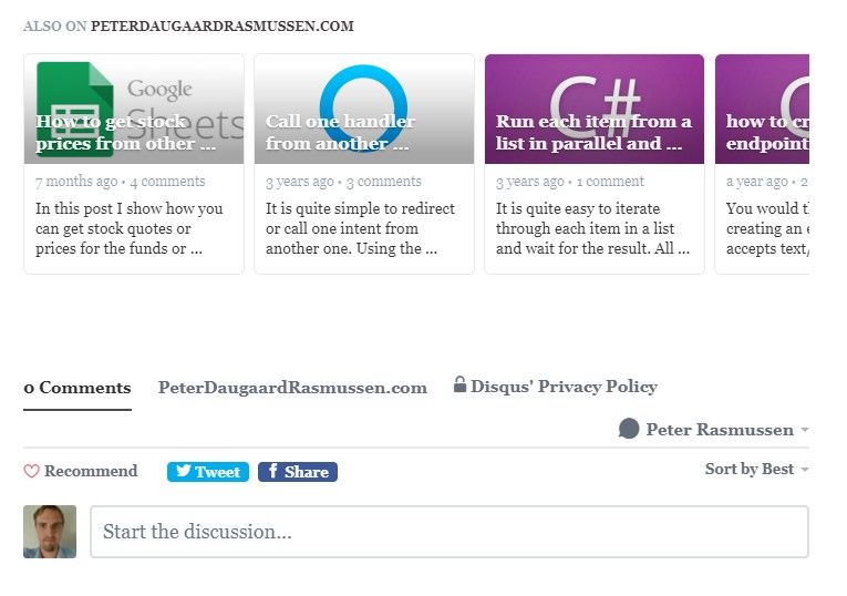
Today my disqus recommendations suddenly looked like the following on my pages:

As you can see, in the above the recommendations are a lot wider than the rest of the page and the comments. When I looked at the mark up I saw the following wrappers for disqus:
<div class="content">
	<!-- Recommendations div inserted by Disqus -->
	<div id="disqus_recommendations" ></div>
	<!-- My target div for disqus -->
	<div id="disqus_thread" class="post" post-id="608d324872faee003b781b83" post-url="https://peterdaugaardrasmussen.com/2021/05/01/visual-studio-2022-will-be-in-preview-in-the-summer/">
    </div>
</div>
The CSS that centers content on my page by adding margin on both sides of it, is based on the class "post". This class is only applied to the disqus_thread div and not the disqus_recommendations div (which is added automatically). I believe previously the disqus_recommendations div was inside the disqus_thread div and not above it. When and why they changed this I do not know. I ended up moving my class "post" one level above, by wrapping disqus_thread within it:
<div class="content">
    <!-- Wrapper added to wrap both recommendations and comments -->
    <div class="post">
        <!-- Recommendations div inserted by Disqus -->
        <div id="disqus_recommendations"></div>
        <!-- My target div for disqus -->
		<div id="disqus_thread" post-id="608d324872faee003b781b83" post-url="https://peterdaugaardrasmussen.com/2021/05/01/visual-studio-2022-will-be-in-preview-in-the-summer/">
		</div>
    </div>
</div>
This gives me the following result:

As you can see the page is now better looking. I believe the mark up for the recommendations used to be inside the targeted element for disqus and not before it.
I hope you found this useful, please write a comment down below if you did!